Everyone has a favourite villain for why graduates end up working below their qualification. Lazy graduates. Outdated universities. An economy that creates the wrong jobs. Each camp argues from its preferred cause and rarely leaves room for the others.
A disciplined root-cause process refuses to start there. Before you can fix a defect, you have to lay every plausible cause on the table at once — and then resist the urge to convict any of them before the evidence is in. That is exactly what the tool below is for.
This is a continuation of my ongoing DMAIC (Define-Measure-Analyze-Improve-Control) public policy case study. In the earlier instalments I established the defect and priced it: 32.2% of employed graduates work outside their field or below their qualification level (Department of Statistics Malaysia, Graduate Statistics 2024) — roughly 1.6 million people — a structural loss the nation has quietly learned to tolerate. This post does something different. It does not add a number. It organises the suspects.
What a Fishbone Diagram Is — and What It Deliberately Refuses to Do
The fishbone (or Ishikawa) diagram is the classic cause-and-effect tool from Lean Six Sigma. The "effect" — the problem — sits at the head of the fish. Every bone branching off the spine is a category of candidate cause. The point is completeness: force every hypothesis into the open so no single pet theory gets to dominate the conversation by default.
The textbook categories (Man, Machine, Method, Material, Measurement, Environment) were designed for a factory floor. A national talent pipeline is not a factory, so applying the six M's literally would have produced forced, unhelpful bins. Instead I reclassified the bones into six branches that actually fit this problem: Demand, Supply, Pipeline, Matching, Governance, and Measurement. Every bone on the diagram traces back to a specific candidate cause I parked during the Define phase for later testing.
Read this before you read the diagram. Every item on this fishbone is a hypothesis, not a finding. A fishbone is a map of suspects, not a verdict. The whole purpose of the Analyze phase in DMAIC is to test each candidate cause against data and separate the vital few causes that actually drive the defect from the trivial many that merely sound plausible. Nothing here has been convicted yet.
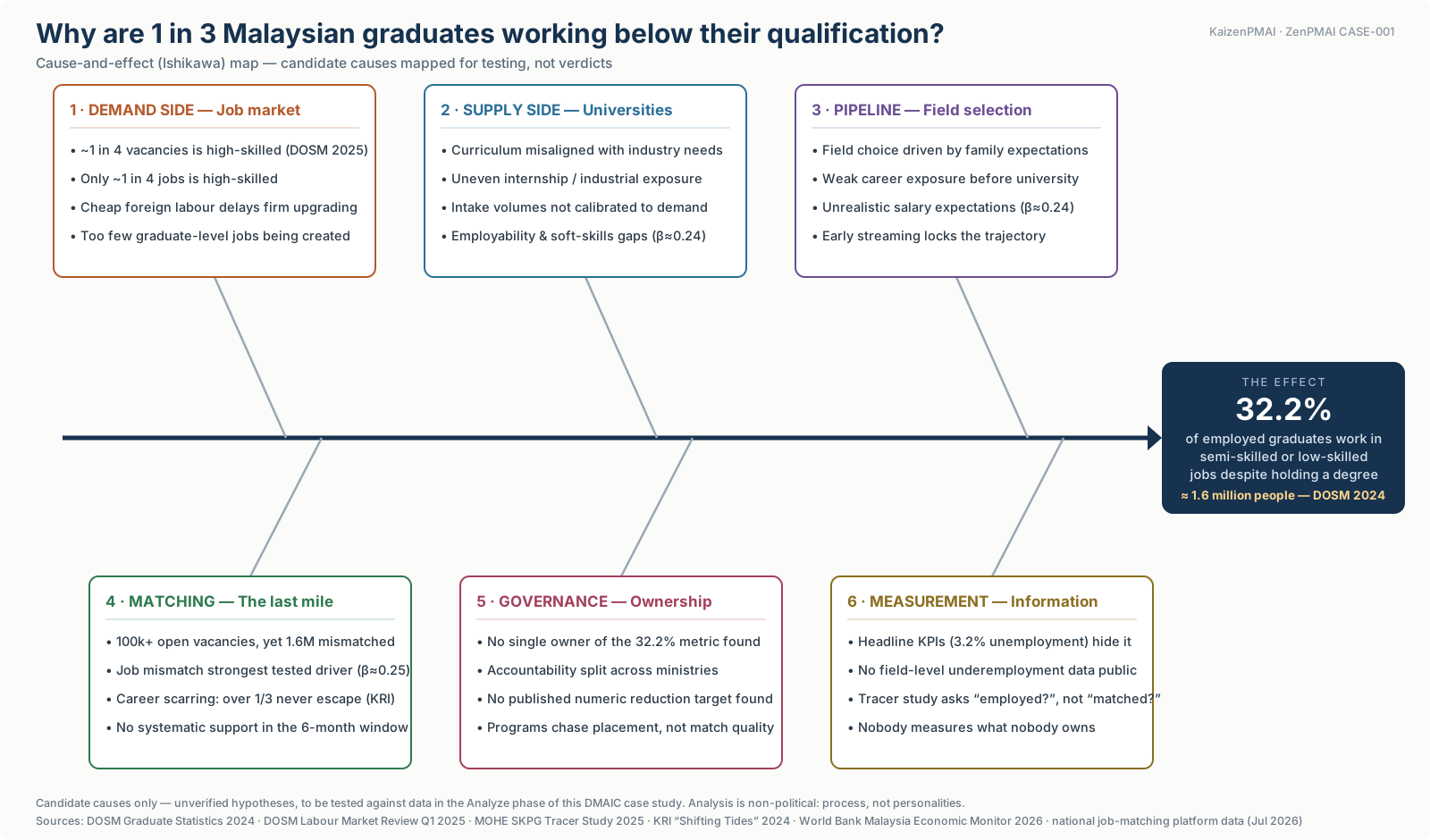 Fishbone (Ishikawa) diagram of candidate causes for Malaysian graduate skill-related underemployment, organised into six branches — Demand, Supply, Pipeline, Matching, Governance and Measurement — all pointing to the effect: 32.2% of employed graduates working in semi-skilled or low-skilled jobs despite holding a degree.
Figure 1 — Cause-and-effect map, ZenPMAI CASE-001. Candidate causes mapped for testing, not verdicts. Sources: DOSM Graduate Statistics 2024; MOHE SKPG Graduate Tracer Study 2025; Khazanah Research Institute "Shifting Tides" 2024; World Bank Malaysia Economic Monitor (April 2026); national job-matching platform vacancy data (retrieved July 2026).
The Six Branches, One at a Time
Each branch below is a category of suspect. I have kept the language deliberately provisional — "appears," "candidate," "not yet verified" — because that is the honest status of every line until the Analyze phase does its work.
1. Demand Side — Does the economy even make enough graduate jobs?
The first suspect is the job market itself. Only about one in four jobs in the economy is high-skilled, and roughly the same share of unfilled vacancies (DOSM Labour Market Review Q1 2025). If the economy structurally under-produces graduate-level roles, then a share of underemployment is baked in before any individual graduate makes a single choice. The sustained availability of cheap lower-skilled labour may also reduce the pressure on firms to move up the value chain. Candidate cause — magnitude not yet quantified for this population.
2. Supply Side — Are universities producing the wrong graduates?
The most-blamed suspect in public debate. The hypotheses here: curriculum that drifts out of step with industry needs, uneven internship and industrial-exposure quality, intake volumes that are not calibrated to what the market can absorb, and employability or soft-skills gaps. These are real candidate causes and belong on the diagram — but they are only one branch of six, and public discourse tends to treat them as the whole fish. The Analyze phase will test how much of the 32.2% they actually explain.
3. Pipeline — Are the decisions made long before university?
Field-of-study decisions are frequently made years before enrolment, shaped more by family expectations, peer pressure, and early academic streaming than by any market signal. By the time a student picks a degree, the trajectory may already be largely set. Weak career exposure before university and unrealistic salary expectations sit in this branch too. This is the "upstream" suspect — the one that is hardest to see because it acts years before the defect is measured.
4. Matching — Does the last mile fail even when the job exists?
Here is a tension the diagram makes impossible to ignore: over 100,000 vacancies sit unfilled on the national job-matching platform while roughly 1.6 million graduates sit mismatched. A pure supply-shortage story cannot fully explain that co-existence. And the first job scars: KRI (2024) reports that over a third of mismatched graduates never escape into a matched role. If the last mile — search, signalling, placement in the critical early-career window — is where the process breaks, then interventions aimed only at supply or demand will miss it.
5. Governance — Who actually owns the number?
This is the branch that reframes the whole case. Across the publicly available strategic documents I reviewed, I could not find a single ministry that owns the 32.2% metric, nor any published numeric target to reduce it. Accountability appears split between the supply side and the demand side of government. This is stated as a verified absence within the documents reviewed, not a claim that no such target exists anywhere — but its apparent absence is itself a candidate root cause. A defect that no one owns is a defect no one is mandated to close.
6. Measurement — Do the official KPIs hide the defect?
The final suspect is the measurement system itself. The headline numbers Malaysia reports — roughly 3.2% graduate unemployment and a ~92.5% employment rate (MOHE Graduate Tracer Study 2025) — can structurally mask underemployment, because the tracer study asks "employed?" rather than "matched?". An underemployed graduate riding a delivery motorbike counts as a success in both green numbers. And I could find little public field-level underemployment data to work with. As the diagram puts it: nobody measures what nobody owns. Branches 5 and 6 reinforce each other.
Why This Diagram Is Also the Bridge Into Analyze
A fishbone is not decoration. In a disciplined DMAIC run it doubles as the hypothesis inventory that the Analyze phase is obligated to work through. Every bone above becomes a testable question:
| Branch | The hypothesis, stated as a testable claim | Status |
|---|---|---|
| Demand | The economy under-produces graduate-level roles, capping the ceiling on matched employment. | Unverified |
| Supply | University output is misaligned with what employers need, in field mix and readiness. | Unverified |
| Pipeline | Field-of-study choices are set upstream by non-market signals and lock the trajectory. | Unverified |
| Matching | The last-mile search-and-placement process fails even when suitable roles exist. | Unverified |
| Governance | No single owner and no numeric target means the defect is structurally un-closed. | Unverified |
| Measurement | Official KPIs are constructed so the defect never appears in them. | Unverified |
That word — unverified, in every row — is the entire discipline. Most public debate skips this step. It picks a favourite bone and argues from there, which is why the same arguments recur every graduation season without ever converging. The methodology exists precisely to stop that: to hold all six suspects to the same evidentiary bar, then let the data promote the vital few and retire the rest.
A fishbone is a map of suspects, not a verdict. The job of the Analyze phase is to turn six branches of "maybe" into a ranked short-list of "here is what actually drives it."
A Note on Neutrality
This analysis is non-political. It examines a process — whichever institution or administration happens to run it — and treats the process, not any personality or party, as the unit of analysis. Where the diagram notes a governance or measurement gap, that is an observation about system design, not an accusation against any office-holder. The full working — sources, calculations, and dead ends included — is documented openly in the ZenPMAI public case repository so anyone can check, challenge, or reproduce it.
This article is part of the ongoing ZenPMAI open research series applying industrial process rigour to public policy challenges. It sits between the Define and Analyze phases of CASE-001. The full DMAIC record and underlying analytical datasets are accessible in the ZenPMAI public repository.
Over to you: before the data speaks — which branch do you think carries the vital few?